Card
Elevation
| Name | Resource |
|---|---|
| Elevation (resting) | @dimen/material_card_elevation_resting |
| Elevation (raised) | @dimen/material_card_elevation_raised |
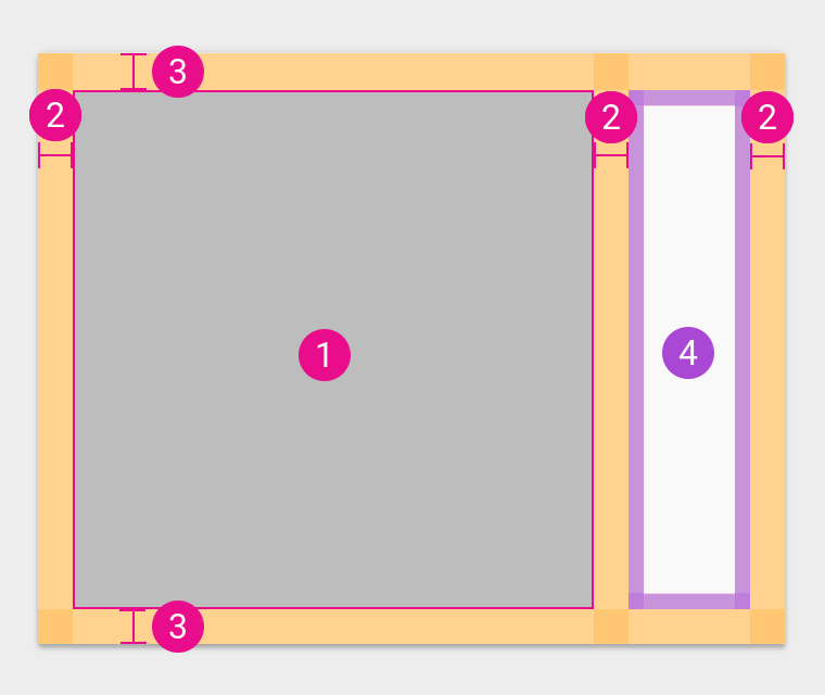
Layout
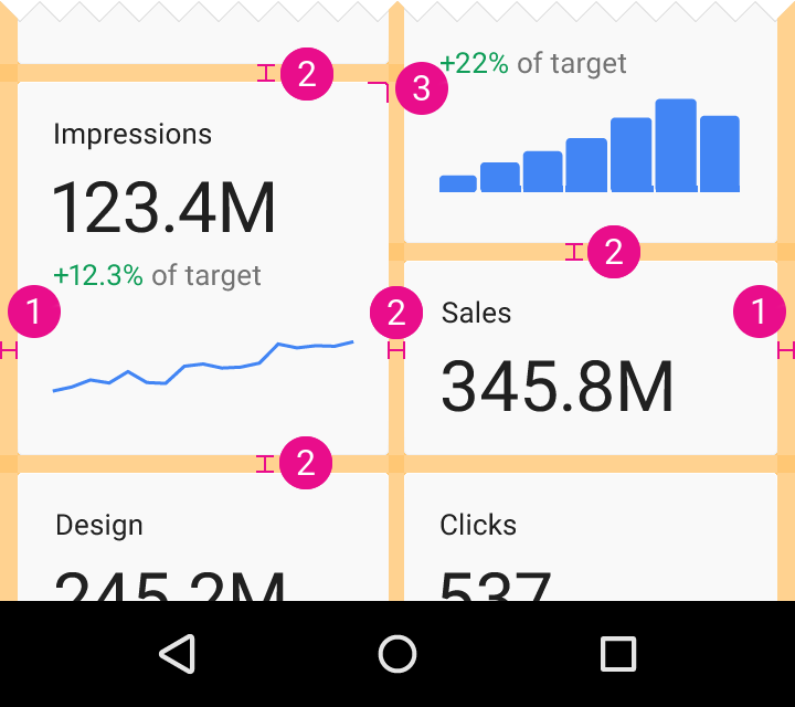
@dimen/material_card_edge_margin@dimen/material_card_gutter@dimen/material_card_corner_radius
Note that the gutter and the edge margin have the same value behind the scenes, if you want to use only one.
Title
Small
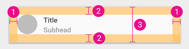
@dimen/material_card_title_block_padding_horizontal@dimen/material_card_title_block_small_padding_vertical@dimen/material_card_title_block_small_height
| Text | Resource |
|---|---|
| Title | @dimen/material_card_title_block_small_text_size |
| Subtitle | @dimen/material_card_title_block_subtitle_text_size |
Large
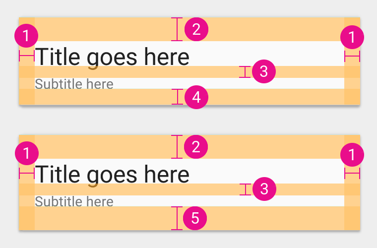
@dimen/material_card_title_block_padding_horizontal@dimen/material_card_title_block_large_padding_top@dimen/material_card_title_block_large_subtitle_margin_top@dimen/material_card_title_block_large_padding_bottom@dimen/material_card_title_block_large_padding_bottom_last_block
| Text | Resource |
|---|---|
| Title | @dimen/material_card_title_block_large_title_text_size |
| Subtitle | @dimen/material_card_title_block_subtitle_text_size |
Supporting text
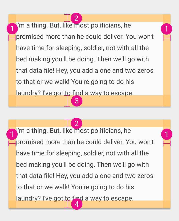
@dimen/material_card_supporting_text_padding_horizontal@dimen/material_card_supporting_text_padding_top@dimen/material_card_supporting_text_padding_bottom_last_block@dimen/material_card_supporting_text_padding_bottom
Text size: @dimen/material_card_supporting_text_text_size.
Actions
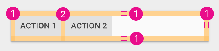
@dimen/material_card_actions_row_padding@dimen/material_card_actions_action_gutter_horizontal
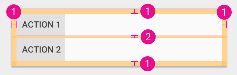
@dimen/material_card_actions_row_padding@dimen/material_card_actions_action_gutter_vertical
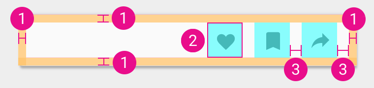
@dimen/material_card_actions_row_padding@dimen/material_card_actions_icon_action_size@dimen/material_card_actions_icon_action_gutter
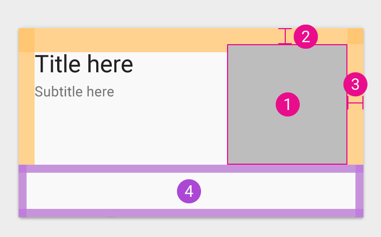
Media area
Basic
The basic media area uses keyline ratios for its dimension, which are not provided in this library.
Check the Material design guidelines for more information.
In title
- See following
sizetable. @dimen/material_card_media_area_in_title_padding_top@dimen/material_card_media_area_in_title_padding_end- Following block
| Size | Resource |
|---|---|
| Small (80dp) | @dimen/material_card_media_area_framed_size_small |
| Medium (120dp) | @dimen/material_card_media_area_framed_size_medium |
| Large (160dp) | @dimen/material_card_media_area_framed_size_large |
| xLarge (240dp) | @dimen/material_card_media_area_framed_size_xlarge |
Framed
- See following
sizetable. @dimen/material_card_media_area_framed_padding_horizontal@dimen/material_card_media_area_framed_padding_vertical- Action block
| Size | Resource |
|---|---|
| Small (80dp) | @dimen/material_card_media_area_framed_size_small |
| Medium (120dp) | @dimen/material_card_media_area_framed_size_medium |
| Large (160dp) | @dimen/material_card_media_area_framed_size_large |
| xLarge (240dp) | @dimen/material_card_media_area_framed_size_xlarge |
Inset divider
| Name | Resource |
|---|---|
| Height | @dimen/material_divider_height |
| Horizontal padding | @dimen/material_card_divider_inset_padding_horizontal |