Metrics & Keylines
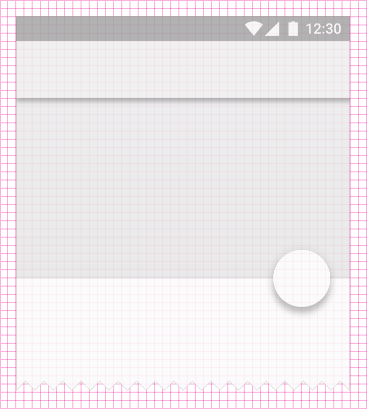
Baseline grid
Baseline grid values are provided as multiples:
@dimen/material_baseline_grid_1x@dimen/material_baseline_grid_2x- ...
@dimen/material_baseline_grid_24x@dimen/material_baseline_grid_25x
Half-increments are also available for centering elements:
@dimen/material_baseline_grid_0.5x@dimen/material_baseline_grid_1.5x- ...
@dimen/material_baseline_grid_8.5x@dimen/material_baseline_grid_9.5x
It is recommended to use the baseline grid to specify component dimensions.
Increments
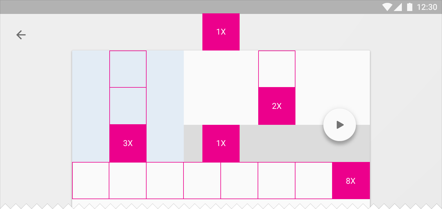
Increment values are provided as multiples:
@dimen/material_increment_1x@dimen/material_increment_2x- ...
@dimen/material_increment_9x@dimen/material_increment_10x
The increment size is based on the app bar size.
| Device type | Size |
|---|---|
| Phone (landscape) | 48dp |
| Phone (portrait) | 56dp |
| Tablet | 64dp |
Every dimension relying on increments is provided alongside an @integer value so that a custom increment size can be used.
Half increments are also available for centering elements:
@dimen/material_increment_0.5x@dimen/material_increment_1.5x- ...
@dimen/material_increment_3.5x@dimen/material_increment_4.5x
Content keylines
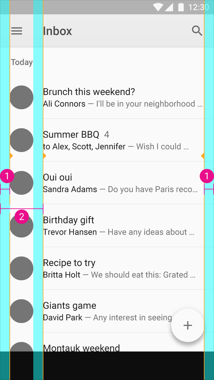
@dimen/material_content_edge_margin_horizontal@dimen/material_content_secondary_edge_margin_start
Other keylines
| Keyline | Value |
|---|---|
| Toolbar iconography | @dimen/material_baseline_grid_toolbar_icon |
| Typography | @dimen/material_baseline_grid_typography |
Related apps
Want to display these keylines on your device?
Use one of the following apps:
| Name | Google Play | Github |
|---|---|---|
| Material Keylines | Google Play | Github |
| Material Cue | Google Play | - |
| Keyline Pushing | Google Play | - |